Brand Guidelines
Below includes guidelines for using SGN logos, color schemes and other media. Please follow all below guidelines whenever using our media or representing SGN. While this document is meant to answer most questions, it is not an exhaustive guide. If you have questions or need help please contact an Officer.
Logos
SGN
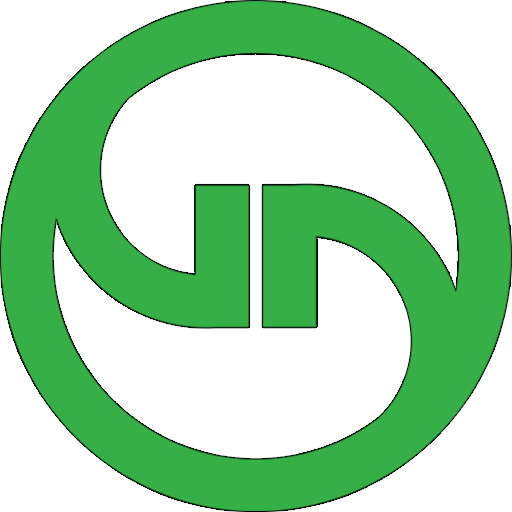
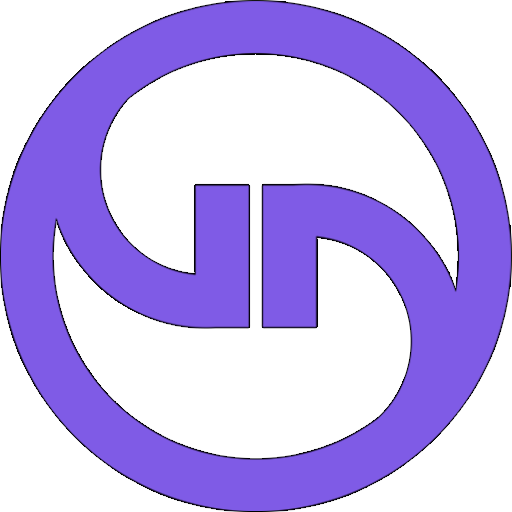
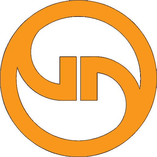
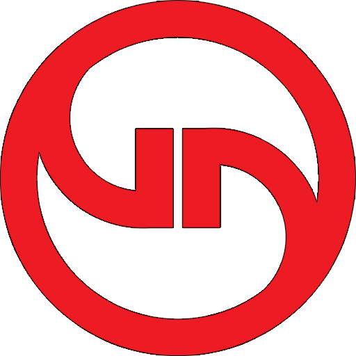
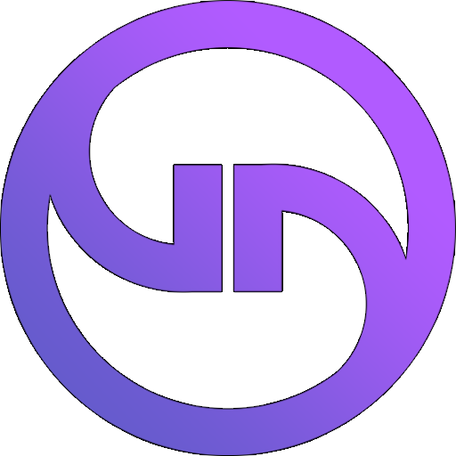
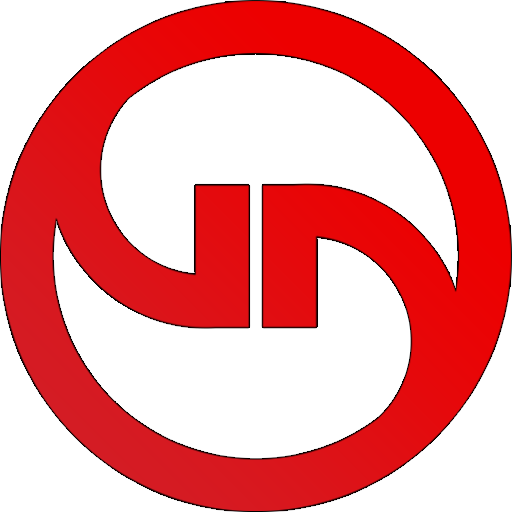
At its basic, the SGN logo is a round shape with two prongs entering the circle, creating a sort of ying-yang shape, which also overlap creating S, G and N shapes. The logo doesn't have a specific color or pattern, but below you can find our brand colors and suggested options.
When displaying the SGN logo, be sure to give an adequate margin between the logo and neighboring elements. We suggest a minimum if 1rem. Be sure to take contrast into consideration. A dark color should be used in on light backgrounds and vice versa. A black or white border can help the logo stand out in low contrast areas.
Guilds
Solid

Gradient


Swatches
SGN's color scheme is a modern blue on blue dark theme with strong color accents and gradients. The color scheme is meant to be easy on the eyes with clean edges and crisp font.